

Painting Your Open Concept Space
Open concept living spaces have become one of the most popular home designs in recent years. They offer a spacious, airy feel and allow for seamless flow between different areas of your home. But when it comes to painting these large, interconnected spaces, many homeowners are faced with the question: Should I paint it all one colour or mix it up with different hues? In this blog post, we'll explore the pros and cons of both approaches and provide you with practical tips to achieve the best look for your open concept space.
The Charm of Open Concept Living
Open concept spaces are loved for their versatility and modern style. They break down barriers (literally) and create a more inclusive environment. Without walls separating the kitchen from the dining area or living room, the entire space feels larger and more inviting. But this design also presents some unique challenges, especially when it comes to deciding on a colour scheme.
Why Colour Choice Matters
The colours you choose for your open concept space can significantly impact the overall aesthetic and feel of your home. The right palette can create a sense of unity and flow, while the wrong choices can make the space feel disjointed and chaotic. Understanding the principles of colour theory and how different hues interact is essential for making an informed decision.
Benefits of a Single Colour Palette
Creating Harmony and Flow
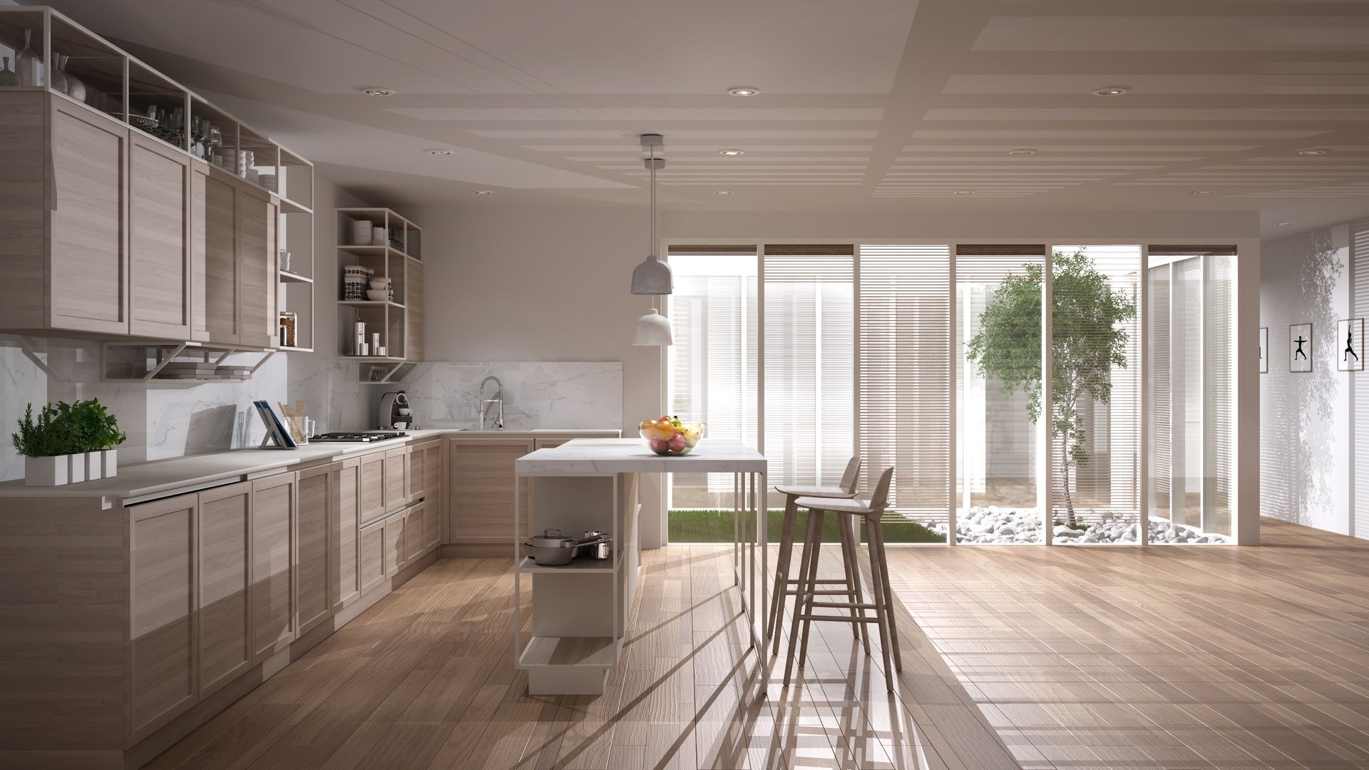
Using one colour throughout your open concept space can create a harmonious and cohesive look. This approach allows for a seamless transition between different areas, making the space feel more unified. A single colour palette can also help smaller spaces appear larger by reducing visual clutter.
Simplifying the Design Process
Choosing one colour simplifies the decision-making process. You won't have to worry about coordinating multiple hues or ensuring that different shades complement each other. This can save you time and reduce the stress associated with selecting a colour scheme.
Highlighting Architectural Features
A single colour can act as a neutral backdrop, allowing architectural features and furnishings to stand out. This is particularly beneficial if you have unique design elements or statement pieces that you want to highlight.
The Case for Multiple Colours
Adding Depth and Dimension
Using multiple colours can add depth and dimension to your open concept space. Different hues can be used to define specific areas, such as the kitchen, dining area, and living room, without the need for physical barriers. This approach can create visual interest and make each zone feel distinct.
Reflecting Personal Style
Incorporating a variety of colours allows you to express your personal style and preferences. Whether you prefer bold, vibrant shades or subtle, muted tones, a diverse colour palette can make your space feel uniquely yours.
Enhancing Mood and Functionality
Different colours can evoke different moods and serve various functional purposes. For example, a calming blue can be used in the living room to create a relaxing atmosphere, while a cheerful yellow in the kitchen can boost energy and creativity. By strategically selecting colours based on the intended use of each area, you can enhance the overall functionality of your open concept space.
Tips for Using One Colour
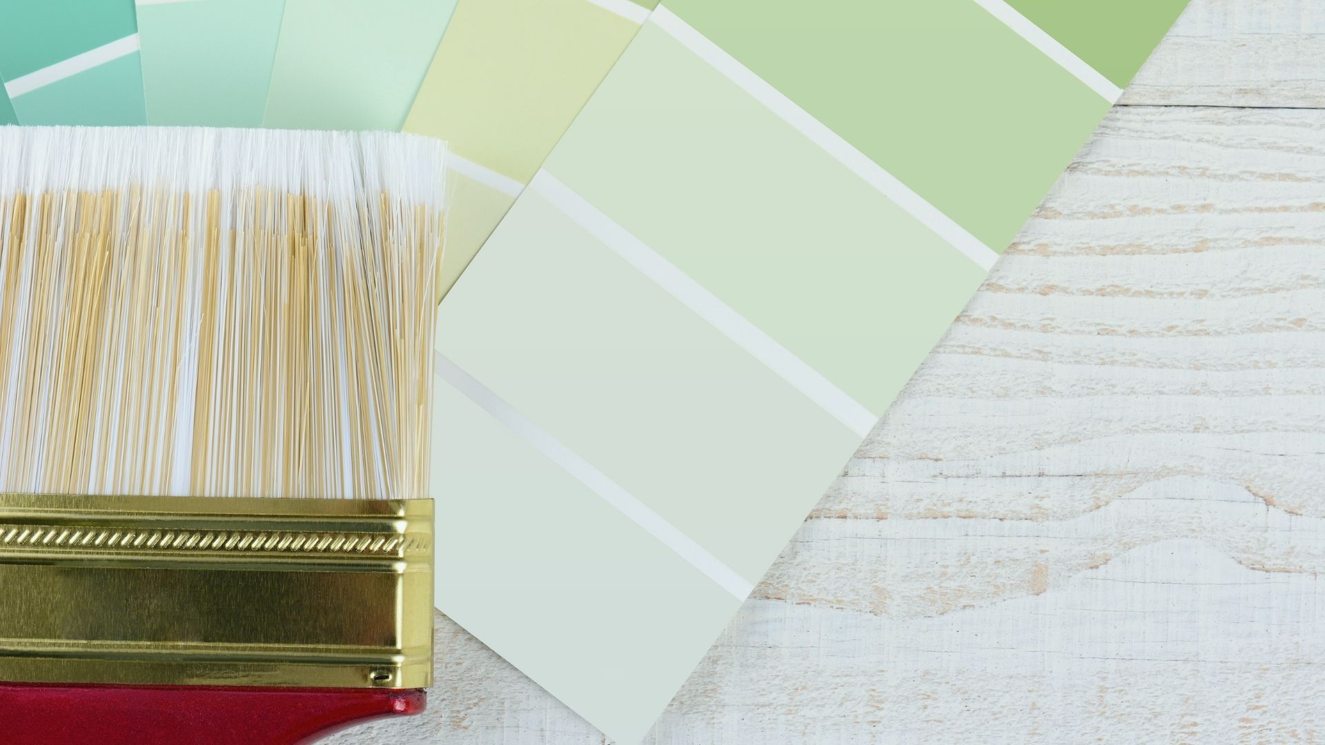
Choosing the Right Shade
If you decide to go with a single colour, it's crucial to choose the right shade. Consider the natural light in your space, as it can affect how the colour appears. Light, neutral shades like soft grays, beiges, or whites are safe bets that work well in most open concept spaces.
Incorporating Texture and Contrast
To avoid a monotonous look, incorporate different textures and contrasts within the same colour family. For example, you can use matte and glossy finishes, or combine smooth and textured surfaces. Adding contrasting elements, such as dark furniture against light walls, can also create visual interest.
Using Accent Pieces
While your walls may be a single colour, you can still introduce pops of colour through accent pieces. Throw pillows, rugs, artwork, and other decorative items can add vibrancy and personality to your space without overwhelming the overall look.
Tips for Using Multiple Colours
Establishing a Colour Scheme
When using multiple colours, it's essential to establish a cohesive colour scheme. Choose a primary colour and a few complementary or accent colours that work well together. You can use colour wheel tools and online palettes to find harmonious combinations.
Zoning with Colour
Use different colours to define distinct zones within your open concept space. For example, you might paint the kitchen area a warm, inviting colour while using a cooler, calming shade for the living room. This zoning can help create a sense of separation and organization.
Balancing Bold and Neutral Tones
Balance bold and neutral tones to maintain harmony in your space. If you opt for a vibrant colour on one wall, balance it with neutral shades on the surrounding walls. This prevents the space from feeling too busy and ensures a cohesive look.
Practical Examples
Example 1: Soft Neutrals
Imagine an open concept space painted entirely in a soft beige. The light colour creates a sense of continuity and openness. Textured rugs, wooden furniture, and colourful cushions add depth and interest without disrupting the overall flow.
Example 2: Bold Accents
In another example, picture a space with a neutral base colour, like light gray, complemented by bold accent walls in the dining area and kitchen. The vibrant shades of teal and mustard create distinct zones while maintaining a unified look through coordinated decor and accessories.
Example 3: Monochromatic Magic
A monochromatic colour scheme involves using different shades and tints of the same colour. For example, varying shades of blue can be used to create a cohesive yet dynamic look. Light blue walls, navy furniture, and turquoise accents can add layers of interest to your space.
Common Mistakes to Avoid
Overwhelming with Too Many Colours
Using too many colours can make your open concept space feel chaotic and overwhelming. Stick to a limited palette of 2-3 primary colours and a few accents to maintain balance.
Ignoring Lighting Conditions
Natural light can significantly impact how colours appear in your space. Test paint samples in different lighting conditions before making a final decision to ensure the colours look as expected.
Neglecting the Ceiling
The ceiling is often overlooked in the painting process, but it plays a crucial role in the overall aesthetic. A lighter ceiling colour can make the space feel taller, while a darker shade can add coziness and intimacy.
Whether you choose to paint your open concept space in one cohesive colour or experiment with multiple hues, the key is to create a balanced and harmonious look that reflects your personal style. By considering factors such as natural light, texture, and functionality, you can transform your open concept space into a beautiful and inviting home. The experienced team at Peninsula Painting in Hamilton is here to help you.
When you’ve made to the decision to paint your open concept space. call on the team at Peninsula Painting in Hamilton for a free quote. They pride themselves as being professional and detail-oriented. Let Peninsula Painting Hamilton Contractors transform your home with a Stroke of Excellence!
Call 905-570-3156 or take advantage of their online form and they’ll get back to you!